The Magic of Color

The Magic of Color

As I mentioned colors are around us everywhere we turn, we just need to recognize them much more. All colors, with the exception of neutral grey will make an impression on people. As previously stated people will react to colors either positively or negatively, however never indifferently.

Confused, I hope not allow me to elaborate; not all colors affect people in the same way nevertheless there are many that do, and these are called objective colors.

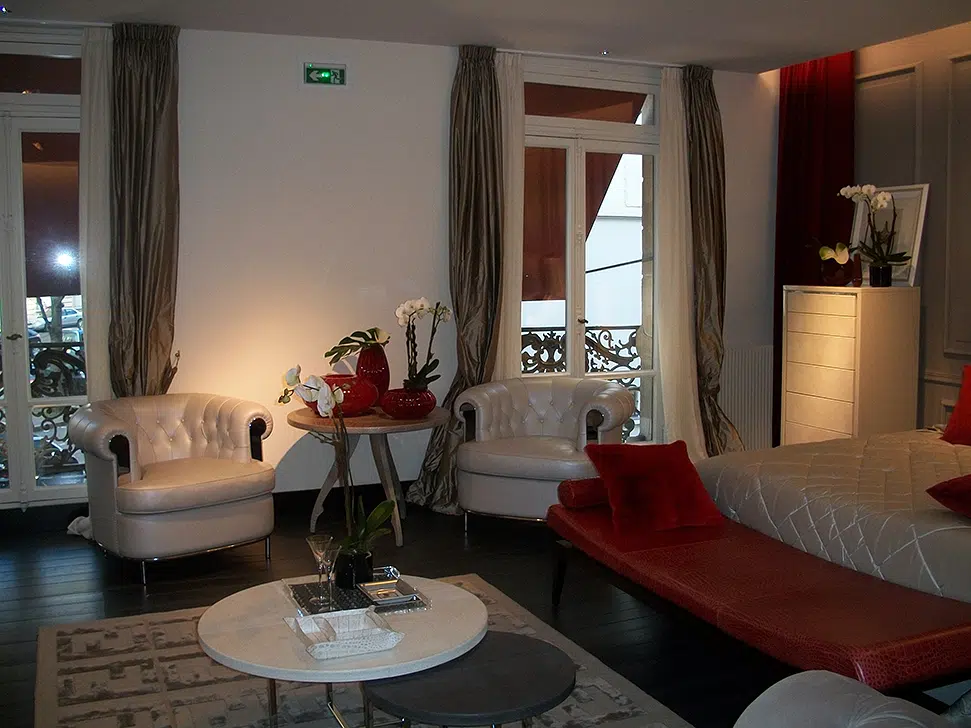
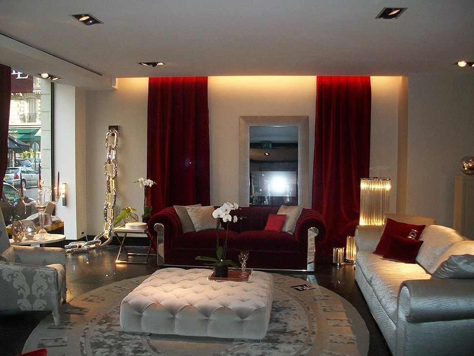
For example Red is an objective color, most people associate red with danger, blood, stop or even passion, well the color of St. Valentine is Red, right? With most colors, people will behave in a predictable way; this is called a ‘predictable response’.

For example, red will always stimulate your appetite, look around almost all the fast food chains and restaurants, you will notice one thing, almost all of them have the color red in their logo’s, signage, decor or tableware. Do you think this is a coincidence, well I don’t.

Great way to make you spend more money eating out ah? Just by using color to stimulate your senses. Amazing!!!

On my next blog I will focus on the different color families and how they make us feel emotionally, don’t miss it.

The Power of Color

The Power of Color

Many people believe that our choice of color is a matter of preference, well it is and that’s only up to a point. However, it is more important that the colors we use for our homes, our business environment and even what we wear, have a positive effect on us and the people around us.

Well as crazy as this seems, color does influence us psychologically, no pun intended. They all have a major impact on the way we feel and respond to different scenarios. Some colors can stimulate us to be more receptive, energized, more sensitive, and romantic or even more creative, I guess that’s why I surround myself with colors that inspire me. The exact opposite can happen with the wrong colors.

Next time you are looking around, shopping for clothes, accessories, think and watch out for others reaction when you try something on, you will be amazed.

The Emotions of Color

The Emotions of Color
Part 2: Cool Colors

Cool colors open up spaces and make them appear larger while creating a relaxed atmosphere.Blues: Tranquil The soft relaxing shades of light blue creates a calm bedroom, while a deep blue palette adds a fresh yet classic look to a living or dining room. Purples: Luxurious Provides a regal palette of elegant color and depth and creates an elegant family space or unforgettable bedroom. Greens: Renewals For an instant feeling of balance and harmony use green in an entry way to welcome guests or create a spa feeling to a bathroom. Silver: Enrich From silver to platinum use this color as a shimmering detail in a bedroom, living room or dining area or to give a high-tech modern look to the kitchen. To wrap things up on cool colors, let us bear in mind that tints of these colors create a restful and soothing feeling unless they are too intense in Chroma.

Now that we understand how far a change in color used in our spaces can affect us emotionally, lets focus on the final group of colors, neutral colors in the final part of this blog.

The Emotions of Color

The Emotions of Color
Part 3: Neutral Colors

Cremes: Calm Creams are ‘Calm’ when used alone, the soft shades will provide a natural backdrop for walls and windows, compliments all colors and acts as a transition between rooms. Beiges: Friendly From formal to casual, alone or in combination with colors from light to dark. Use this color as the foundation for any room. Browns: Earthy Brown, this strong color transitions from the professional feel of a home office to chic when paired with color to create a fashion feel in a bedroom or living room. Greys: Dignified This classic color adds a polished look to a kitchen, a tailored feel to a living room or a trendy statement to a bedroom. Blacks: Command Black adds depth, dimension and style making a dining room more modern or a traditional living room more elegant. Whites: Revitalize Use this pure color to brighten walls and serve as the base for all color combinations or as an accent to break up large areas of color in any room. When it comes to selecting color for your space the choices are many and the opportunities endless. Whether selecting wall coverings, art, accessories or window dressings for your first home or refreshing your existing space use these color principles to help you make your space ‘yours’.

Triptych Wall Art

Triptych Wall Art From Photo Canvas

I recently had the pleasure of working with designer Kobby Akuffo to make a large triptych (pronounced as trip-tik) wall art for a doctor’s office. Making a photo canvas is not new to me, but making a triptych is. I learned a lot during the process, and can’t wait to share some tips with you because a triptych is, simply put, stunning.

A triptych consists of three different images that are related in some way. It can be a single image divided into three panels, or three different images of the same topic from a different viewpoint. Each image is made of the same size and medium, so the group tells a better story than a single image. Human eyes are more attracted to an odd number of objects, so a 3-image grouping is more effective than 2 or 4. In this article, I’ll discuss a few things to consider when making and putting up triptych wall art.

How big is the wall?

The first thing my designer did was measure the wall to be decorated. It was 15’ long and 8’ tall. After comparing a few blank canvases, we decided on the “20×30”.

What’s the color theme?

When I showed my images to the designer, he quickly passed on my favorite ones and instead, picked those I had ignored. The reason? Images should have at least one or two colors that can be found in the rest of the environment. The wall was a pastel green, and there was already a piece of metal wall art with deep red and dark green colors. To make the space look unified, we chose photos with either deep red, dark green, or both. With this in mind, a series of my sunset photos was a good choice.

You probably can argue “I don’t care about the color theme, I just like to show off my favorite photos.” “I want the colors of the photos to pop.” Well, it’s your space and you have the final call in what you put on your walls. Most often, though, we want harmonious space, and keeping the colors consistent can contribute to an impression of unity.

What kind of environment?

As for the subject of your image, you must consider the function of the space and the effect of your decoration. We don’t want to steer away from anyone at the doctor’s office, so we stayed away from images with people in it. Nature photos bring the outside in and have a calming effect. Most people like the beauty of a sunset; it is relaxing to look at, making it a perfect subject for patients to view when entering the waiting area. If decorating a child’s room, you may consider photos of things your kid loves, his toys, abstract images that can stimulate his or her imagination, such as giant bubbles, kites, sandcastles, etc.

Picking the right gathering of images

When choosing different photos of the same subject, they need to be different but still related somehow. Some examples include taking images from different angles or with a different perspective. It could also be photos of the same subject taken at different times. For example, my sunset photos were taken minutes apart. They were a long shot of the sun over the open water; a silhouette of a stone sculpture nearby; and a close-up of it. Photos were taken at different focal lengths from a nice series, such as a forest, a tree, its branches, and close-up blossom.

If you choose to divide a single image, pick landscape orientation, and ensure each panel has its own point of interest.

The thickness of the canvas

Canvas frames typically range from 3/4 of an inch up to 2” thick. You may like the gallery look of a thicker framed canvas, but certain factors can affect your decision. If it’s a narrow space (corridor), you want to go with a thinner canvas to avoid accidental brushing by the passers-by. Another thing to consider is how much weight the wall can hold if your chosen location doesn’t have studs in just the right spots.

What goes onto the canvas edges?

There are four options: wrapped image, mirror image, black or white. Black or white edges are self-explanatory. The wrapped image literally wraps the edges of the image around the frame. This can cause a loss of viewable content of 1-3”, so be sure to line up the image right, and set your bleeds and borders for which parts of the image you want to make sure don’t get wrapped around a corner. If you choose a mirror image, the whole picture will appear on the front of the canvas and few inches of the outer edge portion will be “mirrored” around the frame. Simply choose which edge option you’d like when ordering your gallery-wrapped canvas.

Prepare print file

Look up the resolution requirement at your printer’s website, resize your image larger to ensure great print quality. Also, remember that a canvas has a unique texture that could lend itself well to enhancing your imagery. For example, if your image is of a low resolution that is fuzzy – but not pixelated – when you blow it up to the size you want to print it, it still could look good, though it may look more like a painting than a photograph. Additionally, you may want to add an extra texture to your photograph or image to make the most of the canvas’s special properties.

Variation

I’ve seen a visually compelling triptych with three panels at different widths. They are not randomly arranged, usually getting wider in one direction or with a larger image at the center with two smaller images on either side.

That’s pretty much all you need to know to make a beautiful triptych photo canvas. I hope this article will entice you to create one on your own.

Maison & Objet Trade Show

Maison & Objet Trade Show

MAISON & OBJET in Paris is a major trade show of lifestyle experience. For two decades, this outsized lifestyle podium at the crossroads of business and creativity provides solutions that meet visitors’ needs from around the world; an event unlike any other. MAISON & OBJET, trade fairs reserved for professionals and their clientele is dedicated to lifestyle, innovation, and design at Paris Nord Villepinte. Fendi Casa brought across elaborate captive audiences with their LUXURY LIVING brand. Here are a few of their collections during Brand Promotions in Paris with my team.

BMO Harris Bank

BMO Harris Bank

BMO Harris Bank developed “Share the Limelight” to highlight selected businesses that are leaving a footprint within the community. BMO is committed to “growing the good in business and life” by addressing access to capital required to ensure the success of Black, Latinx, and women-owned businesses.

Kobby Mason Akuffo is the founder and Principal of Mason Royale Designs whose focus is on “affordable luxury” interior design. Kobby was recently featured as an All-Star during a Chicago Bulls game in collaboration with BMO Harris Bank.

Mason Royale Designs was recognized for changing the narrative and approach to interior design. Kobby believes that smart interior design approaches are achievable and more importantly, must have style that responds to the occupants well-being and way of life. Kobby’s perspective on interior design is that, it has to be affordable and not limited to elitists. When his vision and skill for design is curated for a space, there is an emotion that is evoked and a narrative that comes to life when the owner(s) occupy the built environment. The space reflects an atmosphere of serenity, relaxation, comfort, joy, unity – family/friends, and dialogue. This is Kobby’s area of expertise and what sets him apart from other designers as an All-Star in his community.

Carpets for a Cause Event

Carpets for a Cause Event

Oscar Isberian hosted the 2nd annual Carpets for a Cause charity auction benefitting Designs for Dignity, and it is safe to say the night was a huge success!

Friends and colleagues of the interior design community gathered here at their River North showroom to admire and bid on one-of-a-kind carpets designed by some of Chicago’s finest designers and architects. Including those designs was The Flashner Group; Kim Flashner my design partner on the project. Here are some memories from the event.